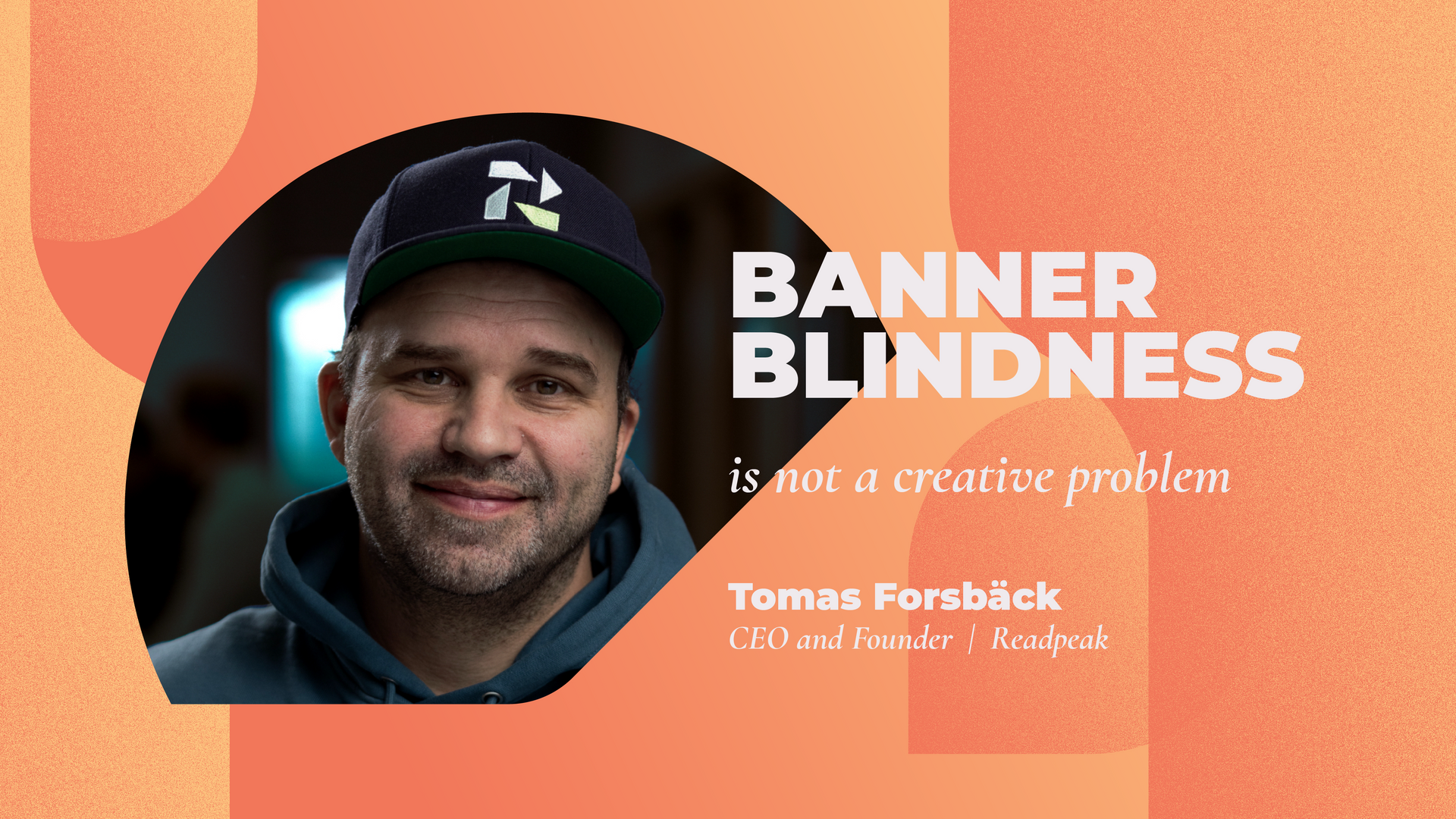
Banner blindness is not a creative problem
Media planners have described banners as wallpaper: always there, rarely studied. Tomas Forsbäck, CEO and founder at Readpeak, deep dives into why visibility and attention are not the same thing, what makes good creative and what actually works.
A conversation I had recently with an adtech executive at an American independent agency stopped me mid-sentence. He described how he subconsciously already knows where his eyes need to scan for content when he opens a page, which means he automatically skims past the display advertising. He does not decide to ignore the ads. His brain does it for him.
Media planners have described banners as wallpaper: always there, rarely studied. That description is more precise than it sounds. Nielsen Norman Group’s eyetracking research, conducted across studies spanning more than two decades, found that ad-designated areas of a page can receive as little as 0.8% of user fixations despite occupying 25% of the available content space. The problem is not that the creative is weak. The problem is that the format has been trained out of our attention entirely.
The instinct that follows, to make the banner bigger, brighter, harder to ignore, is wrong. It accelerates the reflex rather than defeating it. The fix is not to stand out more. It is to stop looking like a banner at all.
Why Visibility Is Not the Same as Attention
Digital advertising has spent years optimizing for viewability: the technical standard that an ad appeared on screen. But appearing on screen and registering in a human mind are two different things. Only a fraction of technically viewable display ads are actually noticed. Viewability measures the first. It has nothing to say about the second.
Banner blindness exposes that gap at its most extreme. Users have become harder to reach for a lot of reasons. They are distracted, yes, but they have become harder to reach with banners specifically because experience has taught them that banners are not worth looking at. That is a conditioned response, and conditioned responses do not yield to louder creative.
Impression-based buying reinforced this problem by rewarding delivery over results. An ad earned its fee by loading on a page. What happened after, whether anyone saw it, read it, or remembered it, was someone else’s problem. That logic kept weak inventory alive and gave planners no structural reason to question the format.
What Actually Works: Blending In
Story-based formats that take on the appearance of having something to say get more attention. When native advertising is designed to match the editorial environment, such as in tone, structure, and visual treatment, it is not ignored on arrival. It earns a look. Story-based native formats generate more clicks and dwell time on brand content post-click, compared to standard display. This is a behavioral outcome produced by meeting readers where their attention already is, rather than competing against it.
The social platforms understood this first. TikTok and Instagram did not try to make ads louder than the feed. They made ads that behaved like the feed. The open web has been slower to absorb that lesson, partly because impression economics gave publishers no incentive to make the transition.
What Good Native Creative Actually Looks Like
The argument for native advertising is only as strong as the creative that executes it. Blending in requires discipline, not just intent. On the surface, it sounds like a concession to design your ad to disappear. But banner blindness is not a reflex against advertising. It is a reflex against a recognizable pattern. Every element of a native ad, the headline, the image, the body copy, either earns a look or triggers the skip. You don’t want to hide the message so much as to deliver it before the reader's brain decides there is nothing here worth reading.
Analysis of more than 22,000 native ad creatives run across Readpeak campaigns points to consistent patterns, particularly in B2B environments where readers are more skeptical and more goal-directed than general consumers.
Headlines Perform Better When They Feel Editorial Rather Than Promotional
Descriptive and narrative formats, and headlines that frame a genuine question or a how-to, consistently outperform hype-driven copy. Hype is exactly what trained readers to skip. A headline that sets expectations and signals relevance looks like content. One that manufactures excitement looks like a banner.
Images Work Best When They Convey Credibility Rather Than Energy
Clear, vibrant visuals with a professional tone, documentary-style photography, or product-focused illustration outperform stock imagery that exists only to fill space. Generic stock photography is the visual equivalent of a banner. It tells the reader's brain that nothing here is worth their time.
Body Text Earns Attention When It Reads Like Something Helpful Rather Than Something Sold
The copy that performs best uses clear, human language, frames the message positively and around solutions, and addresses a real challenge without overselling it. Readers have spent years learning how to filter out promotional language. Copy that sounds like a useful colleague reads like content. Copy that sounds like a pitch deck gets treated like a banner.
The Format Question Is a Strategy Question
Planners who treat banner blindness as a creative execution problem will keep cycling through iterations of the same format with diminishing returns. The format itself is the problem. When an ad looks like a banner, it gets treated like one. Brands getting attention in digital media have stopped running banners and have started running stories.
Tomas Forsbäck
Founder and CEO, Readpeak
Tomas Forsbäck is the founder and CEO of Readpeak, the leading programmatic native advertising platform operating across 10 markets.